Don't Judge a Book by it's Cover...unless you like it
- N.H. Roncolato
- Aug 22, 2017
- 5 min read
We all grow up hearing that quote: "Don't judge a book by it's cover". Sort of like a basic statement about not making decisions based on appearances that seemed to apply to everything.
Well, the fact is EVERYONE judges books by their covers. Especially in today's over-saturated book market, many times the cover is all that people have a chance to see while skimming through Twitter or Amazon or Goodreads. Gone are the days where the cover was just the title and subtitle, explaining what the books contains, like a good 18th Century story.
Of course there are many reasons for this. One, digital art software and printing allows for more complex cover design then just what a basic printing press allowed. Two, we have become a very visually driven consumer culture. We have to like what we see. Three, the advent of the online self-published novel means that there is a plethora of books that need unique covers.
So what does this have to do with my book, you may ask. Certainly given my astute awareness of all things writing, I must have prepared accordingly and known exactly what my cover was going to look like, you might say.
No. None of that. Just like everything else with my novel, The Redemption of Brian O'Connor, I started in one direction and ended somewhere completely different. (i.e. I thought it was going to be a short story and it ended up longer than The Two Towers, etc.)
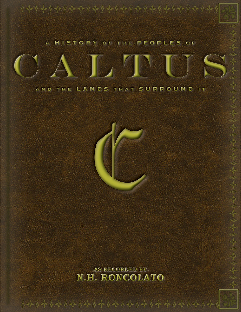
As I mentioned in my previous post, the title of my book changed wildly from inception to publication. The first version of the cover (2014) looked something like this:

I was going for a sort of leather-bound tome idea, and compiled this image using AffinityDesigner (which I already plugged once for free...but will do it again, too)
Now, for those that are good at math, yes, I had been writing for four years before I even attempted to make a cover. That was mostly because I was still composing the greatest epic fantasy novel ever written, but it was also because I had no idea where to start. As you can see, I tried my best but it looks...a little off. Probably because I have had the hardest time finding a 'gold' color and not have it look greenish...
Either way, I had to fix it. Not only did the title change, but my vision for the story was also changing. Thankfully, having a base idea to work with helped, as did my wife/at-home manager's advice to look at other fantasy novels.
So the next iteration came out looking like this:

Note the ornate detail, the fine texturing, and the love and attention paid to every stitch...
OK, I found a stock image online and used that. I do like the idea, but it didn't say anything ABOUT my book. This was when I was in that awkward stage, almost the 'teenage years' of writing, when my original idea about my story was conflicting with what my story was growing into. If I was writing a book about the mid-16th Century political history of the Holy Roman Empire, this would work well. However interesting that may sound, that is not what I wrote.
Alas, I turned back to my trusty design software and came up with a completely different direction, one that I felt spoke to the epic fantasy-ness of my story:

Really engaging, right? There is a whole lot going on there, I can tell you that much. Almost too much...
Yeah, it was pretty busy. Really busy, actually. Far too busy. And again, said nothing about my story or my characters. The map is really cool, but did not work as a cover.
For the fourth time, I threw myself into molding a new cover for my book. I was sure that this would be the last one that I would need to make. So I came up with this:

Yes! I did it! I finally have an epic cover that, if you look closely, combines a few of my previous attempts together. Note the epic map (with a 'spotlight' on Ridgard Ironwall, a little foreshadowing, maybe?). Note the intricate border that seems to be faintly imprinted along the edges. The golden embossed text and the large print for my name...it all works so well together!
Only...it doesn't say anything about my book. There is no indication about what the importance of Ridgard Ironwall is or why the reader should care. There is no indication of characters or even what the genre is. Plus, my name was too big. I always chuckle a little at the book covers where I don't know if the author's name is the title and vice-versa.
So once more, it didn't work. I had reached the limit of my ability. I can doodle here and there, but making a professional looking cover was beyond me. I buckled down and looked for an artist.
I was going to...*gulp*...SPEND MONEY!
I found the perfect artist in the most interesting place, actually. I have a passive interest in drawing myself so I was already following a number of artist channels on YouTube and I had previously stumbled across this fantastic artist, Xia Taptara. You can find his channel here and his website here. Show him some love 'cause he is REALLY talented.
Anyhow, I contacted him and we got the ball rolling. I gave him a sweet stick-figure sketch (which I will send to those who have subscribed to my site) and from that, he sent me this image below:

Isn't it pretty? To be honest, when I first saw the final version I almost broke down into tears. After almost seven years of writing, this was the first time that someone else had presented an image of the story that had been swirling around in my head for so long. It was a very powerful moment.
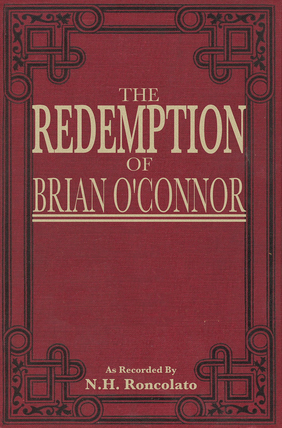
I composed myself and managed to scrape the final version of the cover together, what you see here:

So a big thanks to Xia Taptara for his awesome work, because there was no way I would be able to draw this on my own.
I learned through this whole process of making a cover for my book that sometimes it is worth it to shell out a few ducats to have someone else produce something for you. It went against every fiber in my being to do so, but I am very happy that I did.
Well, OK, I can't take full credit for this. Or any credit, really. My wife/at-home manager really has been a God-send, and she was advising me all along the way. It was her that alerted me to the successes and opportunities of my cover design attempts, and it was her that urged me to look for an artist. I really hate spending money, especially on myself, so I wasn't going to look for an artist on my own. Thanks for the help and advice, hon!
As you can see, the cover design made a fantastic journey on it's own, from the first version to the final. If it wasn't for good advice and a willingness to admit that I couldn't do it alone, my book might look very different.
This brings us to a question: Which image do YOU like? Let me know in the comments below, if not for any other reason than just for fun.
Also, if you know an author who is struggling to figure out their cover, give them your opinion. It is hard for us, the authors, to see our work objectively, and having outside input can really help.
If you all liked this post, go ahead and share it on social media and subscribe to my site. This really helps me out, as I am a self-published author fighting for each step of discoverability I can get.
I appreciate you all reading this and I hope that you get a chance to check out my book, The Redemption of Brian O'Connor, and support your favorite indie author!
Thanks again! Keep reading!
~N.H. Roncolato
To purchase a copy of the best realistic fantasy epic ever written, check it out in paperback or ebook.
Get yours today!


Comments